This are the magazines :
Cinemags
Edition April 2012
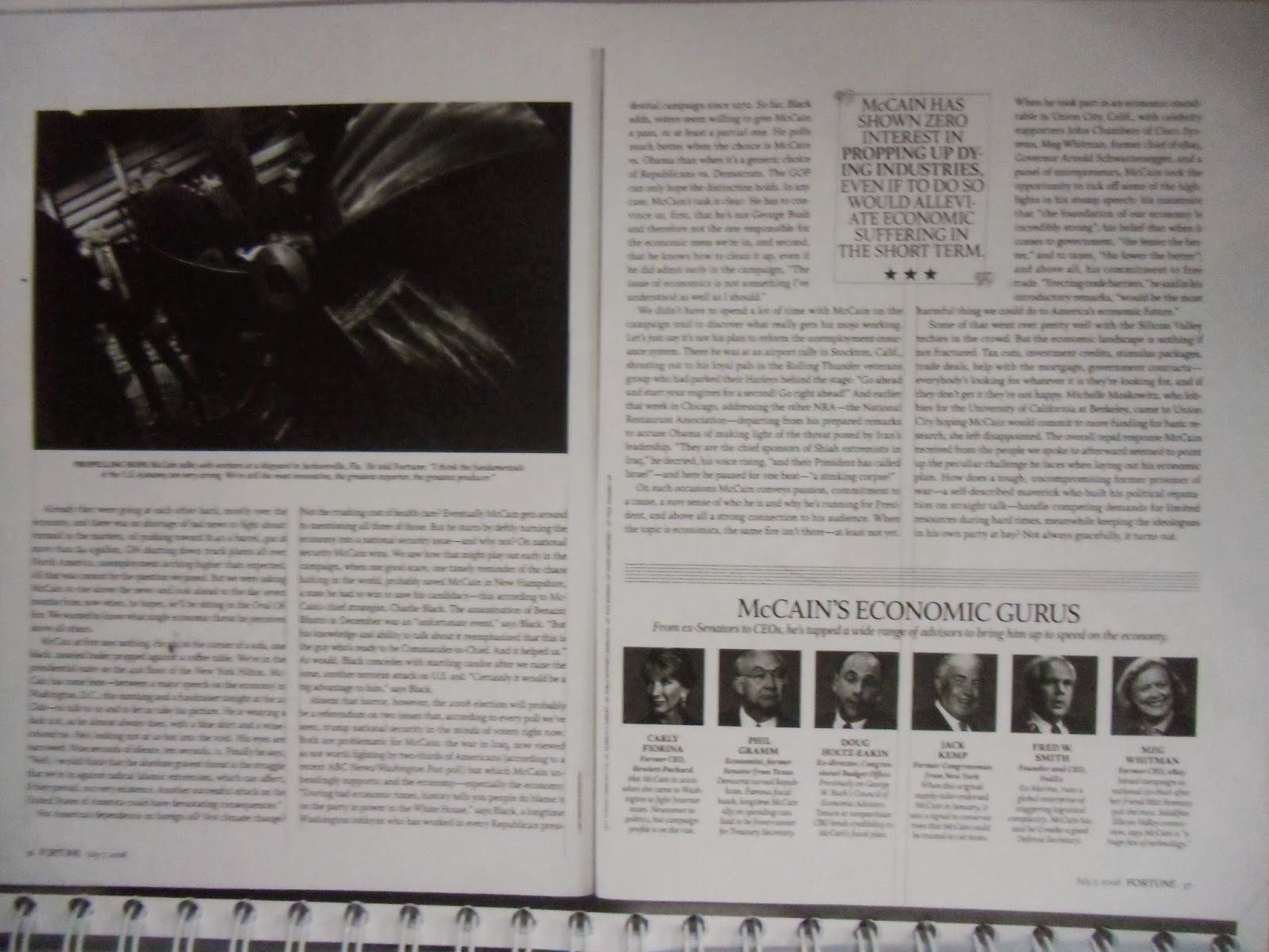
Fortune
Edition July 2008
Cosmo Girl
Edition September 2010
Then I analysed if the typography fits the magazine and the target markets. Because it's important to make the reader feel comfortable to read it. This is my analysis :


No comments:
Post a Comment