Regarding to Web Authoring Class, My lecture, Sir Emanuel gave us 2 options ; Own Portfolio Website or Web Project with theme, "What Designer's Student Want?"
I chose "Own Porfolio Website" because I'm not really good at making website, and the limitation of working time which only 3 weeks, plus I still have the other class projects.
So my concept is Simple and Dreamy. Because I have a simple personality and principle, sometimes I become too relax. And dreamy because of learn about design and become a great graphic designer is my dream since I was in primary school.
References & Colours :
I supposed to make a simple and typical website because I afraid that I couldn't finish it. So this was the first Site-map ;
But then I decided to make it parallax, because it looks modern, interactive and interesting. This is my sketch ;
The Keywords :
Modern
Simple
Bubbly
After I sketched, I made the layout at Illustrator ;
I also make my own icons ;
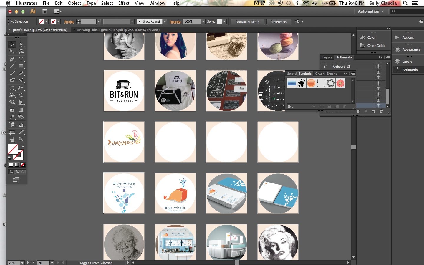
I want my portfolio images in round shape so edited them before ;
After that, I tried to layout it at Adobe Muse
For the icons, I used anchor point. So It's still flexible, If the "viewers" confuse how to back to portfolio page / where to contact, the icons make it more simple for use.
Because I made it a long horizontal, I tried to made it parallax. So it feels more modern and interactive.
For " About me " part , I used my own pictures to give trusted person feeling to my future clients, I also created skill info, So the client know what they need.
For portfolio site, I made it bigger slideshow on the right and thumbnails on the left side. I made it round shape, Because I want to make it consistent because at the homepage I also use round shape, so it feels more friendly and bubbly.
Progress ;
The " Contact me " part is simple and straight forward. I consider all age visitor so I want to mke it simple and easy to interact.
For the "Say Hi" text, I made it as gif with photoshop , so it can change colours by itself ;
So this is how it actually works ;
Thankyou to my lecture, Mr. Emanuel, and all my peers and friends for their helpful feedbacks and opinions. God Bless:)